We finally did it! We completed our kitchen remodel and could not be happier with the results. When we first bought our house, the kitchen was probably the thing I hated the most, but we bought it anyway because it was the best fit for our needs at the time. I love that you can transform a space with a remodel and breathe new life into it. Our house truly feels completely different.
The goal with the remodel was to add our own personal touches to the space, while also giving the kitchen a more open and inviting feel. We removed part of a wall and widened pathways to achieve the look we were aiming for. I am sharing all of the details and specifics surrounding our remodel in this post, but of course, if you have any additional questions, please do not hesitate to reach out.
We used Zion Home Remodeling to complete the project, they also did our bathroom remodels that I shared on the blog earlier this year! Also, in case you missed it, our kitchen remodel “mood board” is also here on the blog (linked!)
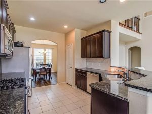
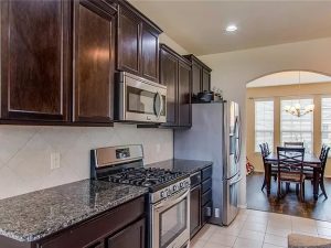
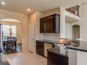
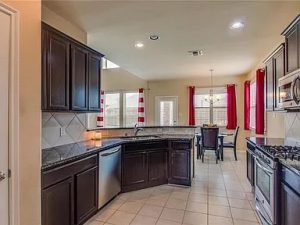
Kitchen “Before” Photos
The brown tones were overwhelming and not our style at all. I scoured Pinterest for inspiration for months leading up to this project, and was able to narrow down exactly what I wanted with the help of Brooke Fish, the in house designer at Zion. When it came to choosing cabinet color, I really wanted something that was beautiful and unexpected. For years I thought that if I ever did a kitchen remodel, it would be all white with gold hardware; and of course when the time finally came, white was so far from anything I wanted for this space.
Kitchen Remodel Layout
We wanted to remove the l-shaped kitchen and create an island. In order to do this, we removed part of the wall where the pantry used to be and opened up as much as we could without compromising the fact that there were load-bearing walls.
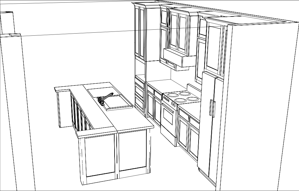
I absolutely loved the fact that the cabinet maker was able to provide a 3D drawing of how the kitchen would look before we got started with everything. It really helped to bring the vision to life and get everyone excited for the remodel. We were not able to remove the entire wall, so there are two pillars in front of the island that are holding up the upstairs. However, even with this, we still accomplished our goal of an open concept kitchen with full visibility into the living room.
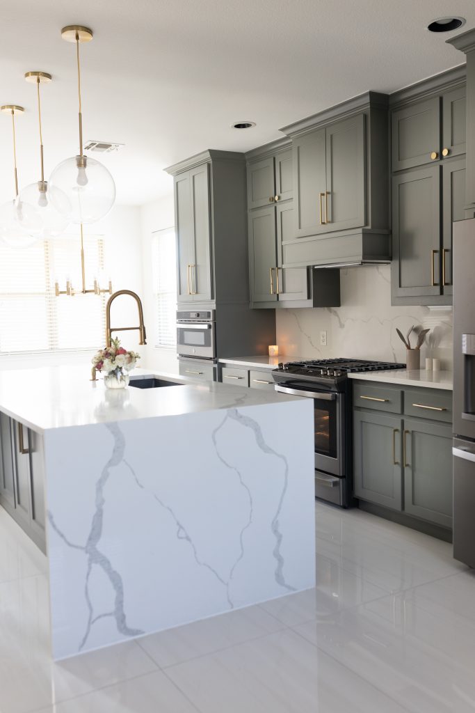
Kitchen Remodel “After” Photos
Cabinet Color
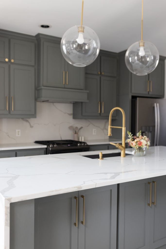
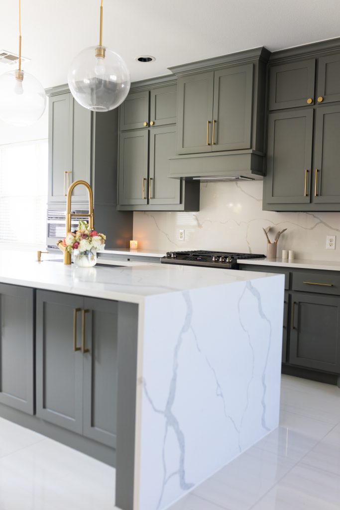
For the cabinets, we chose Sherwin Williams Attitude Grey. It is the perfect mix of grey/green that I was looking for. I am obsessed with the color! It looks so, so good and is exactly what I was hoping for. For the cabinet finish, we went with a semi-gloss. This is a high traffic area and I really wanted to be able to easily wipe off the cabinets with zero stress of ruining anything.

Brass Hardware
I purchased cabinet hardware from Home Depot and really love the satin brass color. I wanted gold hardware that was not going to be too “brassy” looking and the satin brass color looks so nice with the rest of the fixtures throughout the kitchen. We did 3 different knob styles. I linked them all below!
GE Appliances
I am in love with our slate grey appliances. I cringed at the thought of doing stainless steel, so when I saw this color and I was very excited. I was nervous that it wouldn’t look good, but the colors turned out so beautiful with the cabinet color. I linked everything we purchased below. So far, we are really loving these appliances.
Flooring
For the kitchen floors, we opted for a large format tile that was laid in a running bond throughout the kitchen. It turned out so gorgeous! I can’t wait to do something similar in our master bathroom. I linked the exact flooring here.
Thank you for reading!
You can shop all lighting and additional kitchen accessories below in the shop the post section! Thank you so much for reading. This kitchen remodel has been a labor of love and we are so excited to enjoy it for years to come. I am already dreaming up the next project! – XO Steph



hello, wondering if that is a convertible or duct hood vent?
Hi there! So sorry for my delay. This is a duct hood vent.